What is Data Visualization?
In simple terms, data visualization is presenting analytical data in a graphical or pictorial format to make difficult information easy to read, as well as make it easy to identify new patterns. Translating data into visual has become cheap and easy. Data visualization tools display detailed pie charts, fever charts, bar charts, geographic maps, heat maps, sparkline, dials and gauges, and infographic. The two biggest benefits to visualizing data is one, reducing the time to insight and two, improving the accuracy of insights. Psychology plays a huge role in data visualization because of the way you perceive things.
Psychological Schemas
Kendra Cherry defined schema as “a cognitive framework or concept that helps organize and interpret information. Schemas can be useful because they allow us to take shortcuts in interpreting the vast amount of information that is available in our environment.” People do not like to have to use cognitive thinking and try and find shortcuts to anything they can in life. This is important for business to know so that they can take advantages of psychological schemas to improve data visualization.
Shapes, Icons and Symbols
The first schema that can be used to improve data visualization is the use of shapes, icons and symbols. A very basic example would be adding a “+” or “-” sign before a number on a dashboard. This eliminates the words and makes it faster and easier to read. Another way to easier show positive or negative would be to use up and down arrows. Icons are also useful to use instead of words because it is more visually appealing. Icons also help to reduce and even eliminate any language barriers that could get in the way of misinterpreting data. For example, if I am talking about the most popular fruits I would present icons for bananas, apples and oranges instead of writing out the words. No matter what language you speak the icons for these fruits are all the same and therefore there is no way to misinterpret data.
Colors
The second schema that can be used to improve data visualization is the use of colors. We all probably associate the color green with good or go and the color red for stop or bad. No one really knows where this schema came from but if i had to take a guess I would say it is originally because of things like traffic lights and red reminds people of blood which in most contexts is associated with something bad. Knowing the associations that your audience already formed, can be helpful to decrease the time of insight and increase the accuracy of the insight. You also must be aware to not mess with people’s schemas, meaning that if you are giving visuals of vegetables, don’t make broccoli purple and lettuce pink.
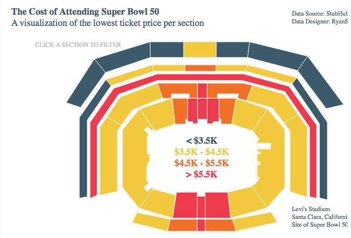
Spatial Context
Maps provide spatial context that helps us when analysing data. For example, anyone who has ever been to a concert or any type of sporting event has seen a map like the image shown below. Someone can use the schema that they have developed throughout their years of going to concerts or sporting events or even just common sense, that the seats on the lower level are more expensive the the seats on the upper deck. The first time I saw a map like this one was when I was buying concert tickets and it was very easy to run the cursor over the different seat colors to figure out the price instead of looking at an excel spreadsheet that would have taken more time to read and probably would not have made sense without the visual.
If these three schemas are used properly, they can definitely help to get the most out of data visualization and to maximize the biggest benefits which is to decrease the time of insight and increase the accuracy of insight. Understanding the psychology behind data visualization can help to give you a step up in better knowing your target audience.
http://blog.jinfonet.com/psychology-of-data-visualization-techniques-and-reporting/
No comments:
Post a Comment